


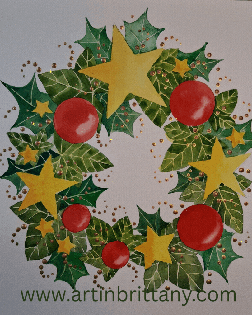
This really is a fun project. I have taught it many times over the last decade and it never fails to please. It is easy to adapt and can be the basis for a Christmas card design. It is straightforward to create, following my directions, but features many skills key to your watercolour progress.
Materials I used -
Fabriano Acid free NOT surface 280gsm (130lb) watercolour paper 35 x 25 cms
Faber Castell - HB pencil 9000
Winsor & Newton - putty rubber
Winsor & Newton pigments - Aureolin Hue, Cadmium Yellow, Winsor Red, Permanent Sap Green, Terre Verte, and Cinnabar Green.
Lefranc & Bourgeois Deco Acrylic - Antique Gold.
Rosemary’s Brushes - Golden Synthetic No 8 round.
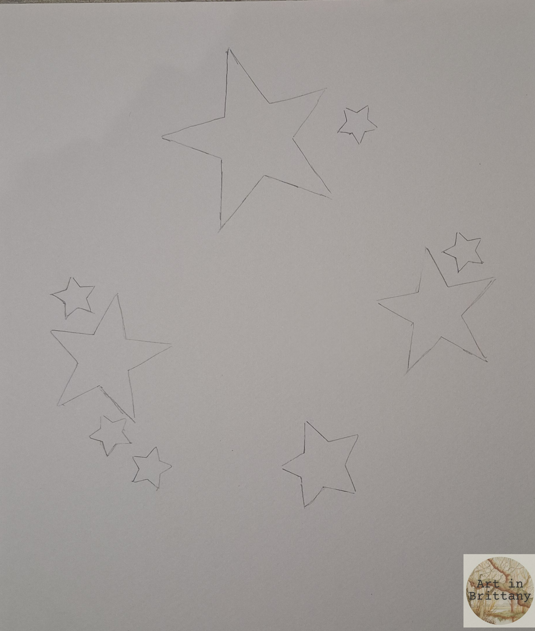
Step 1. Sketch the first layer - stars. Aim for balance that looks random - consider the size and grouping of shapes. Use the templates provided or draw your own.
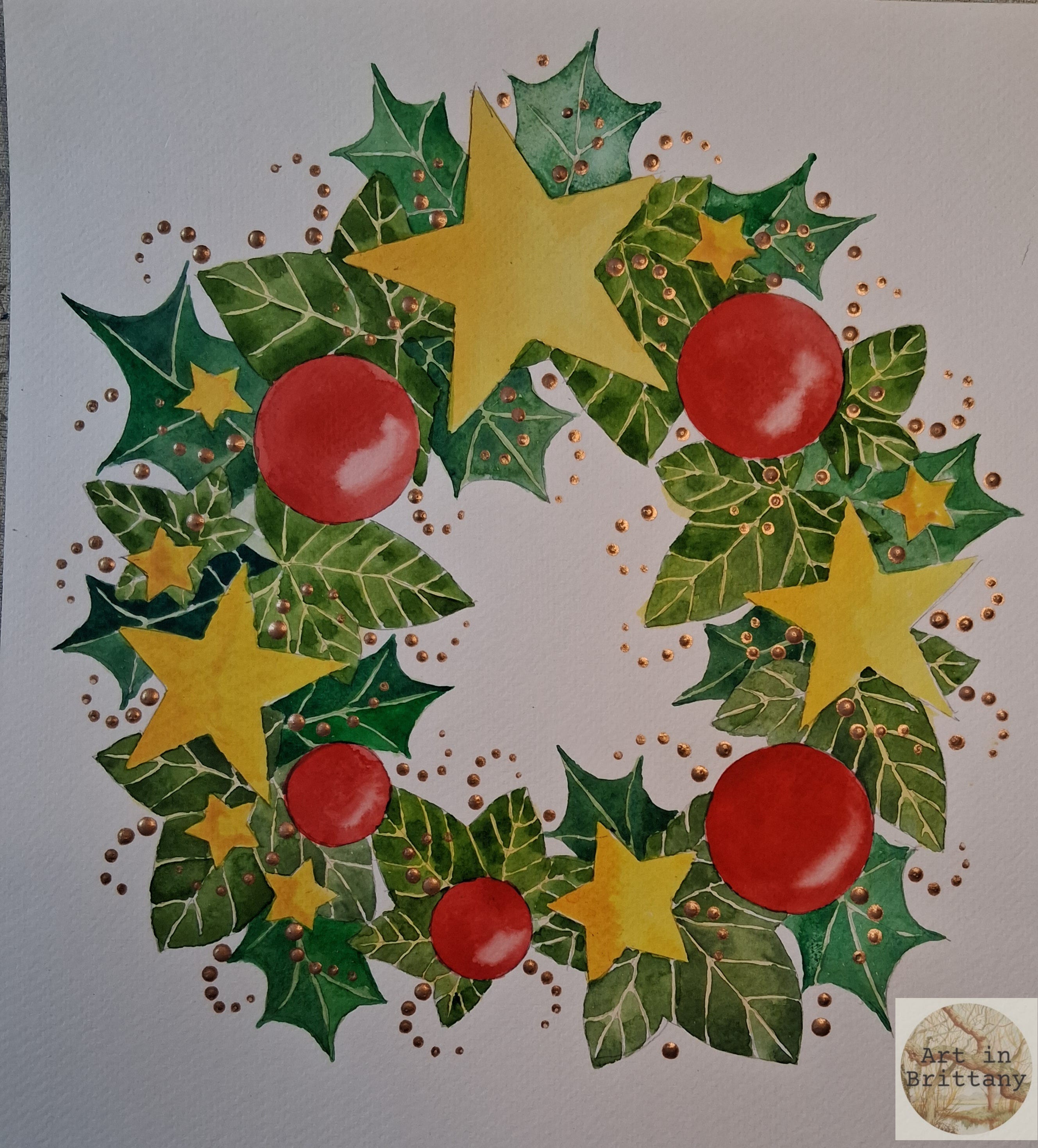
Step 2. Fill in the stars with a colour wash of your choice and while still wet, drop in a darker shade to one side. I’ve used Aureolin Yellow and Cadmium Yellow.
Step 3. Sketch some round shapes to represent baubles - you could also add candy canes, fir cones or any decorations you fancy. Apply a colour wash to your balls and lift out a highlight on one side. Lifting out is simply using a clean, almost dry (hungry) brush to remove an area of wet watercolour. Use the templates provided or draw your own.


Step 4. Now you can gather some ivy leaves (or use the templates provided) - choose leaves that are a suitable scale for your painting. Remove the stems and use the leaves as a template to draw around. Placement of the ivy leaves should underlap the stars and balls but not overlap each other - pencil in a simplified version of the veins. As before, you are aiming for a balanced wreath.


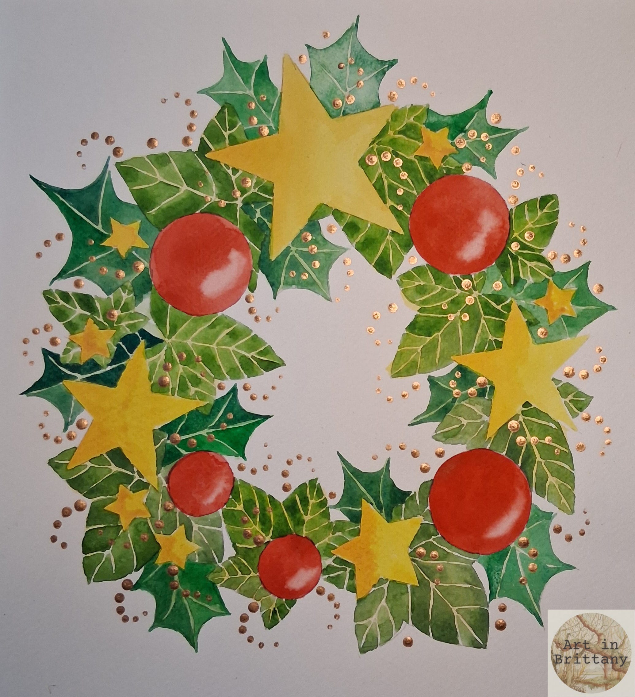
Step 5. The next stage is to fill in all the leaves with a soft yellow wash, no need to be too picky here as long as the veins are covered and patchy coverage is better for this stage. I used a pale wash of Aureolin Yellow but any pale ‘leafy’ colour is fine. When the yellow base coat is dry, (important because the next part requires crisp edges), fill in each leaf segment with a green wash leaving fine gaps where the yellow shows through to define the veins. This technique is called ‘negative painting’ .You are aiming for variation in the strength of green for a natural look. I’ve used Permanent Sap Green and Terre Verte. Note that I have added an extra small star (top left) for balance.


Step 6. The wreath is really taking shape now. The next layer is sketching holly leaves, I used cut out templates to draw around, adding guide lines for the veins - position them so that they emerge from behind the other elements but do not overlap each other. Colouring them is the same process as for the ivy leaves - start with a base layer, I used a light wash of Permanent Sap green, then add a darker, bluer shade for the segments between the veins


Step 7. Now to add a bit of bling! To finish off your wreath add curlicues of dot trails to add further balance. One of the most useful brush strokes is the humble dot. It is easily achieved by dipping the wrong end of (a suitably shaped/sized) brush into a puddle of colour and dabbing the upright brush on the paper - the first dot is the biggest , subsequent dots become progressively smaller as the paint runs out. I used this process with gold acrylic paint - it works equally well with glues to which you can add glitter if you wish.
When everything is completely dry rub out any visible pencil lines. This design is endlessly customisable - have fun with it!