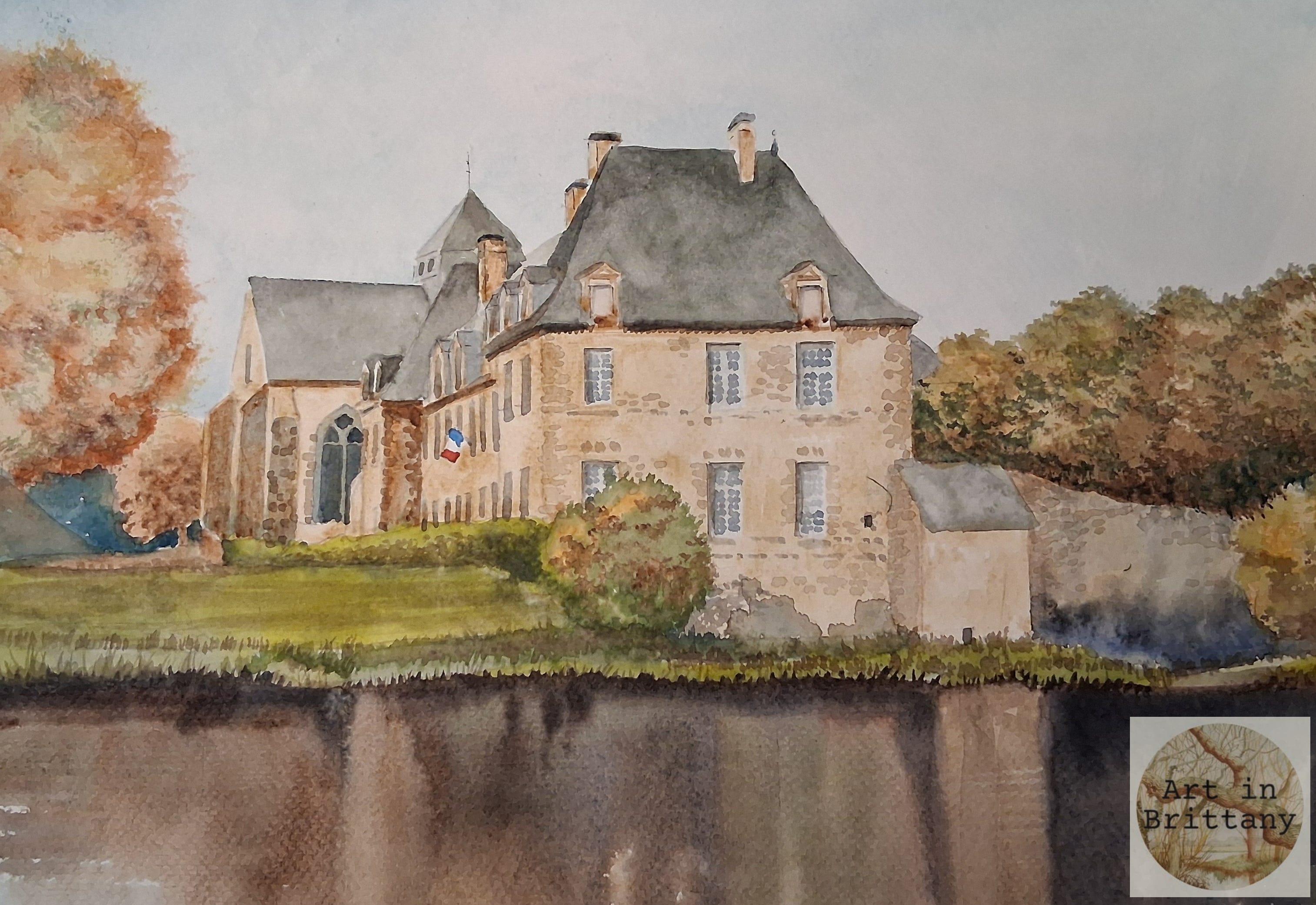

The Abbaye Notre-Dame de Paimpont is a striking blend of Gothic and Baroque architecture. Originally founded as a Benedictine priory in the 7th century by Saint Judicaël and Saint Méen, the abbey took its present form in the 13th century and became a powerful religious and civic centre. Its weathered stone façade, arched windows, and serene setting evoke centuries of monastic life, local justice, and seasonal gatherings. Today, the abbey stands as a quiet sentinel of Breton heritage—its silhouette mirrored in the still waters, inviting contemplation and artistic reverence. It is a favourite spot, not far from us, on the edge of the Broceliande forest.
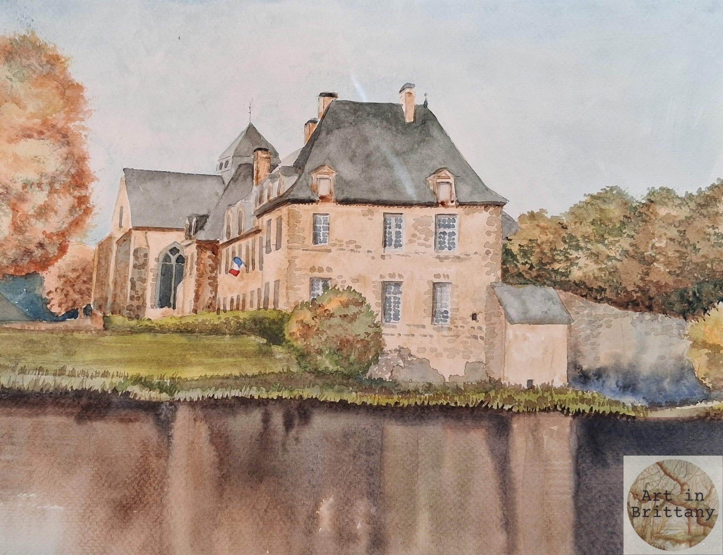
The Project
Architecture can be daunting to paint, but this piece, really a colour sketch, demonstrates that intricate detail is not always necessary to convey the sense of a building. This is a pared back painting made with a limited palette in less than an hour.
Materials I used -
Fabriano Acid free NOT surface 280gsm (130lb) watercolour paper 35 x 25 cms
Winsor & Newton pigments - Prussian Blue, Raw Umber, Burnt Umber, Caput Mortem, Vandyke Brown and a touch of Winsor Red..
Rosemary’s Brushes - Golden Synthetic No 8 round, Short Flat Shader, fine liner/rigger.
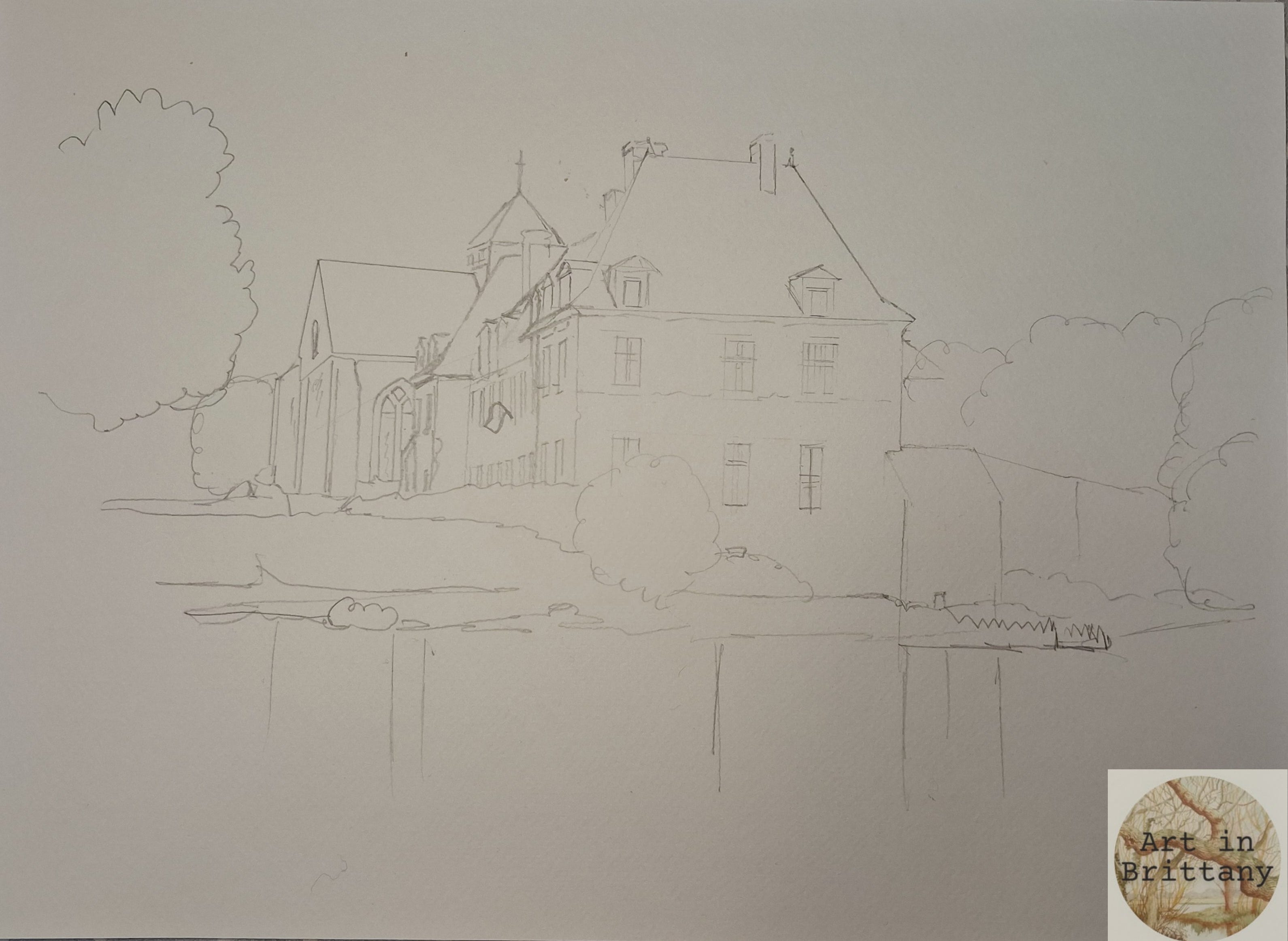
Step 1. Sketch out the main composition. Take care to maintain verticals above and below the water line and remember to employ the rules of visual perspective for the diagonals. Keep your pencil marks minimal; just as much as you need to plot out the main shapes.
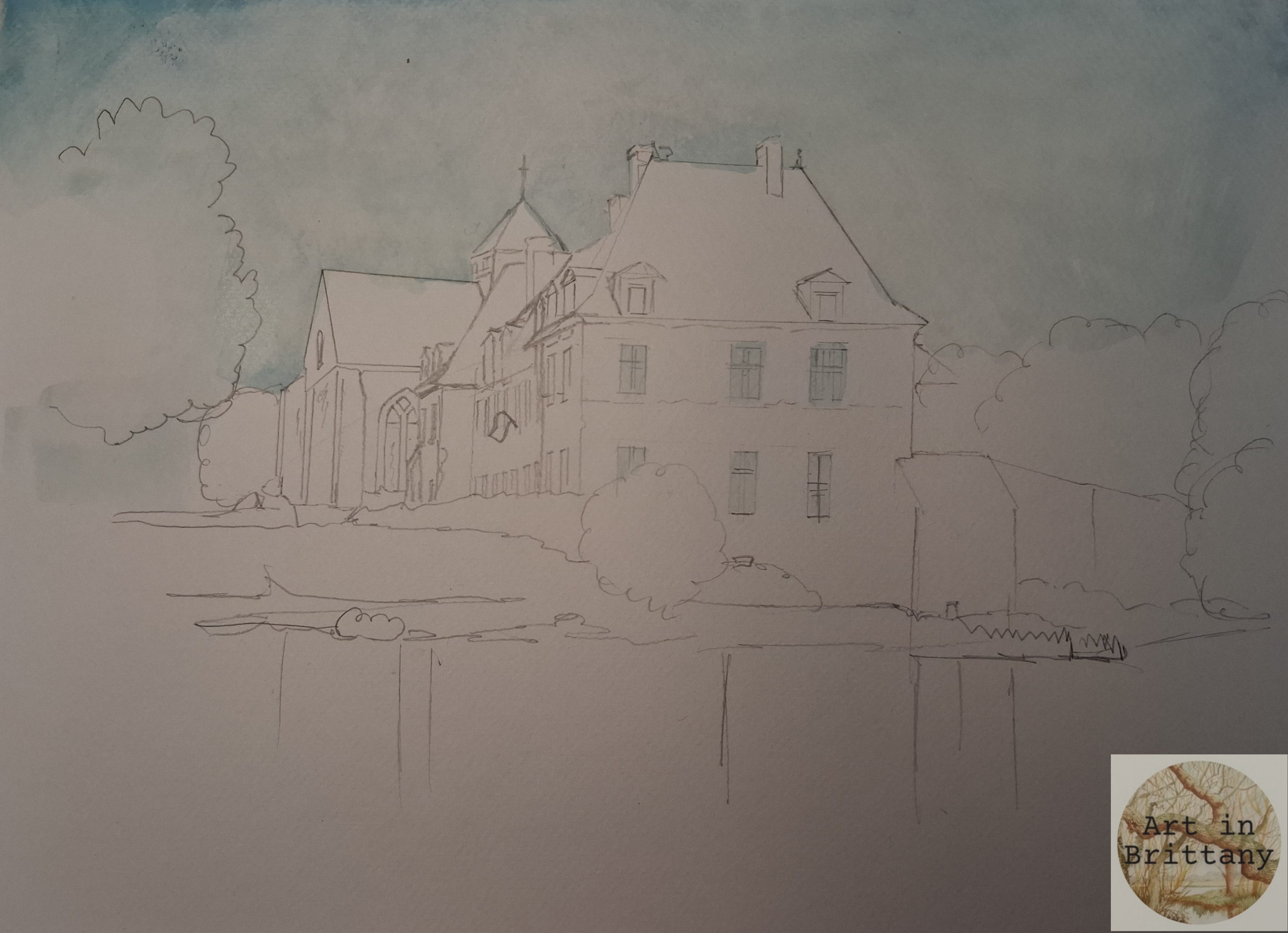
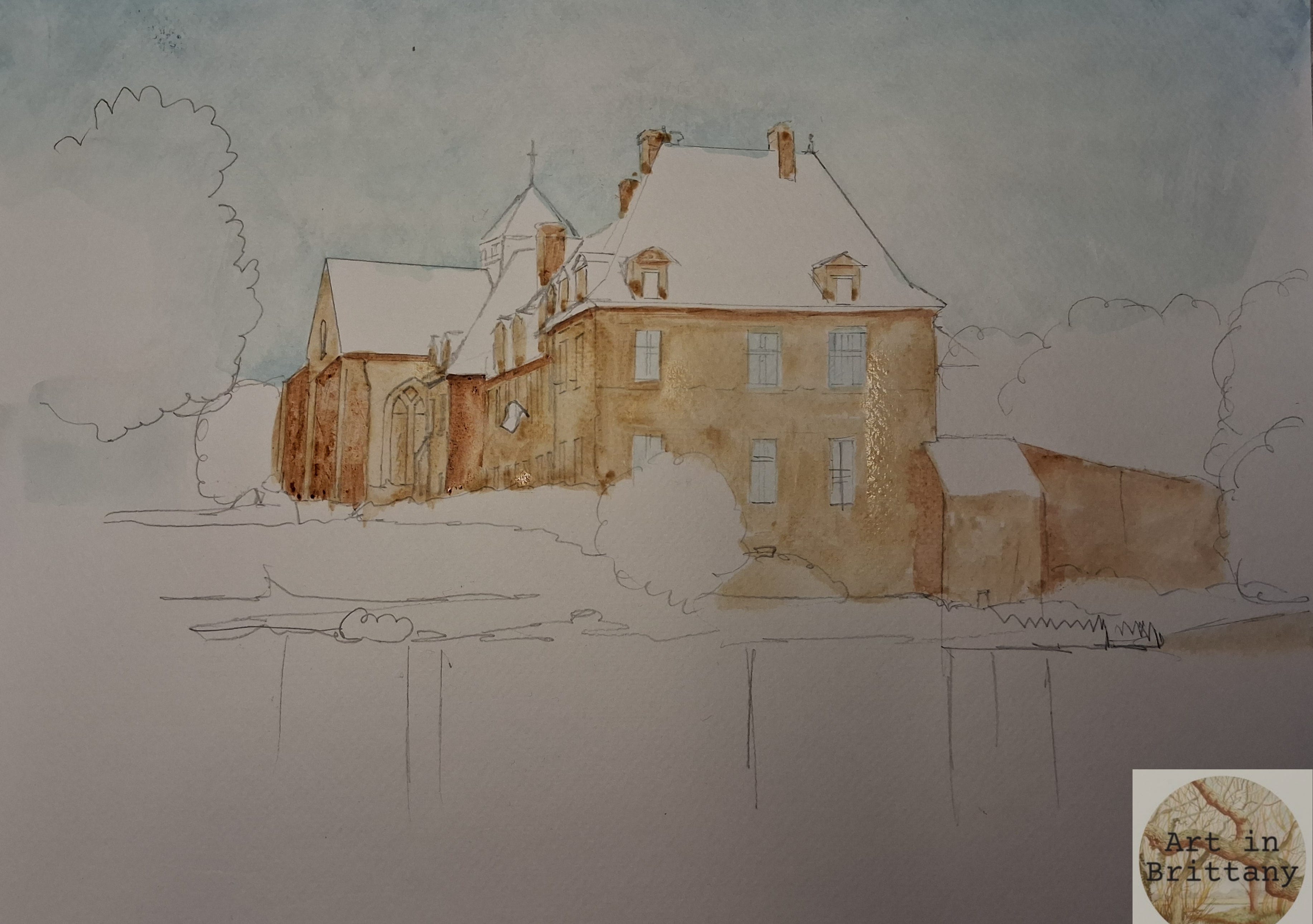
Step 2. Add some sky. I wet the whole sky area and dropped in some Prussian Blue. I put a very light wash of the same colour over the larger windows to take the whiteness off.
Step 3. Block in the walls of building with a wash of Raw Umber, deepen shadow areas with Burnt Umber.
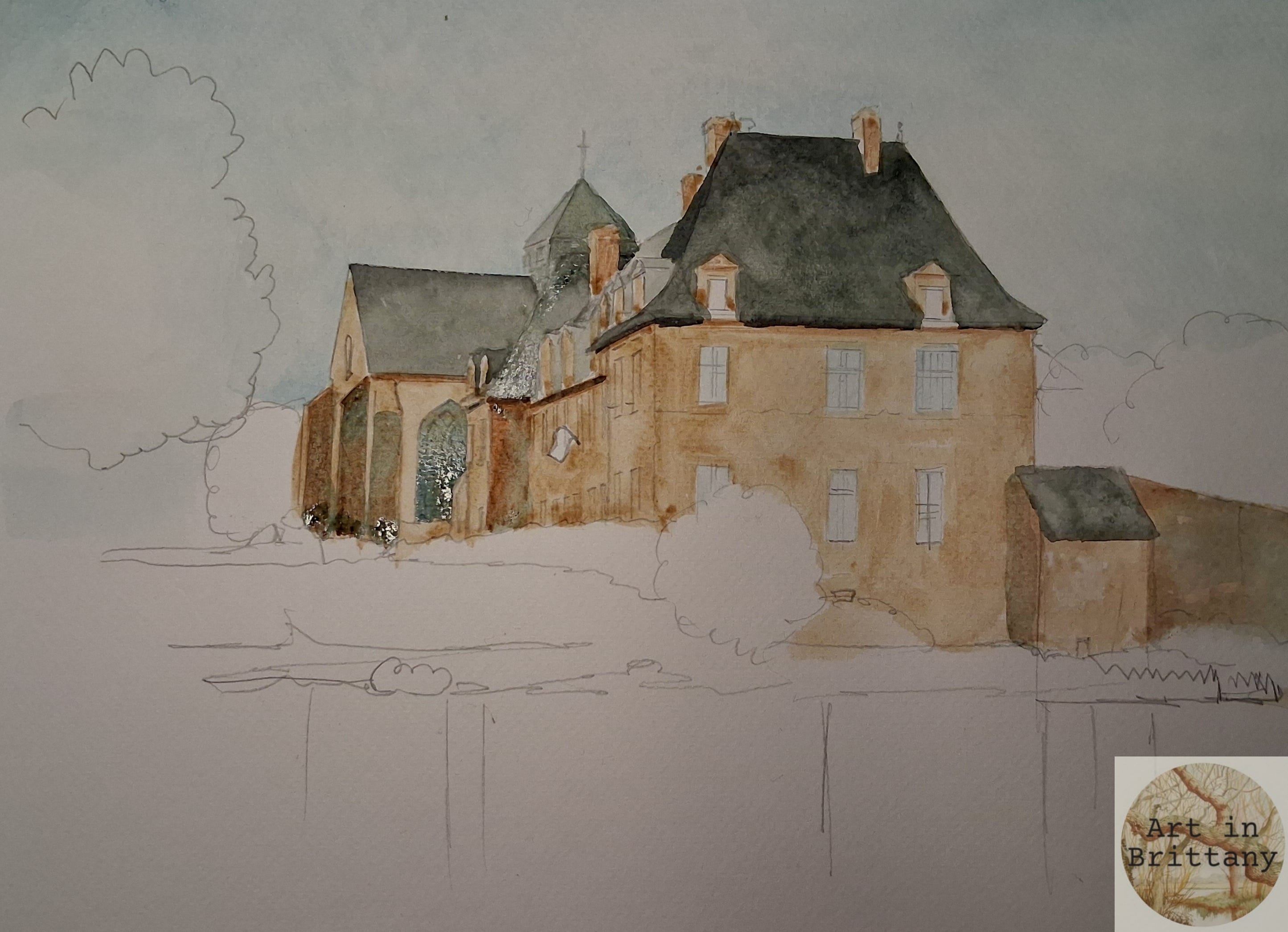
Step 4. Apply grey washes to the roof areas and the large church window - I mixed Burnt Umber and Prussian Blue to make this grey.
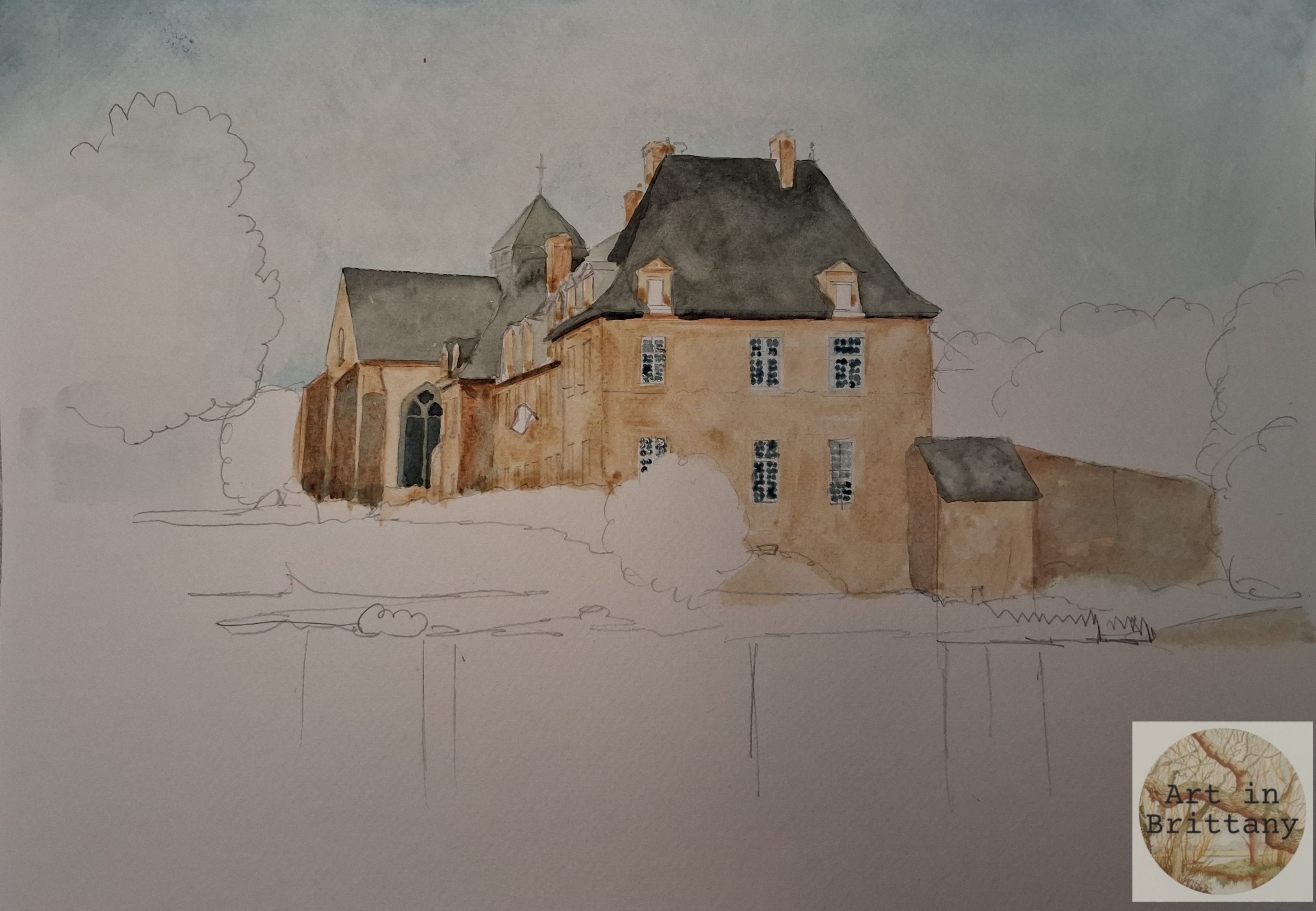
Step 5. Using the same grey apply small brush marks to describe the small panes of glass in the large windows. Use a stronger mix to deepen the shadows under the eaves.
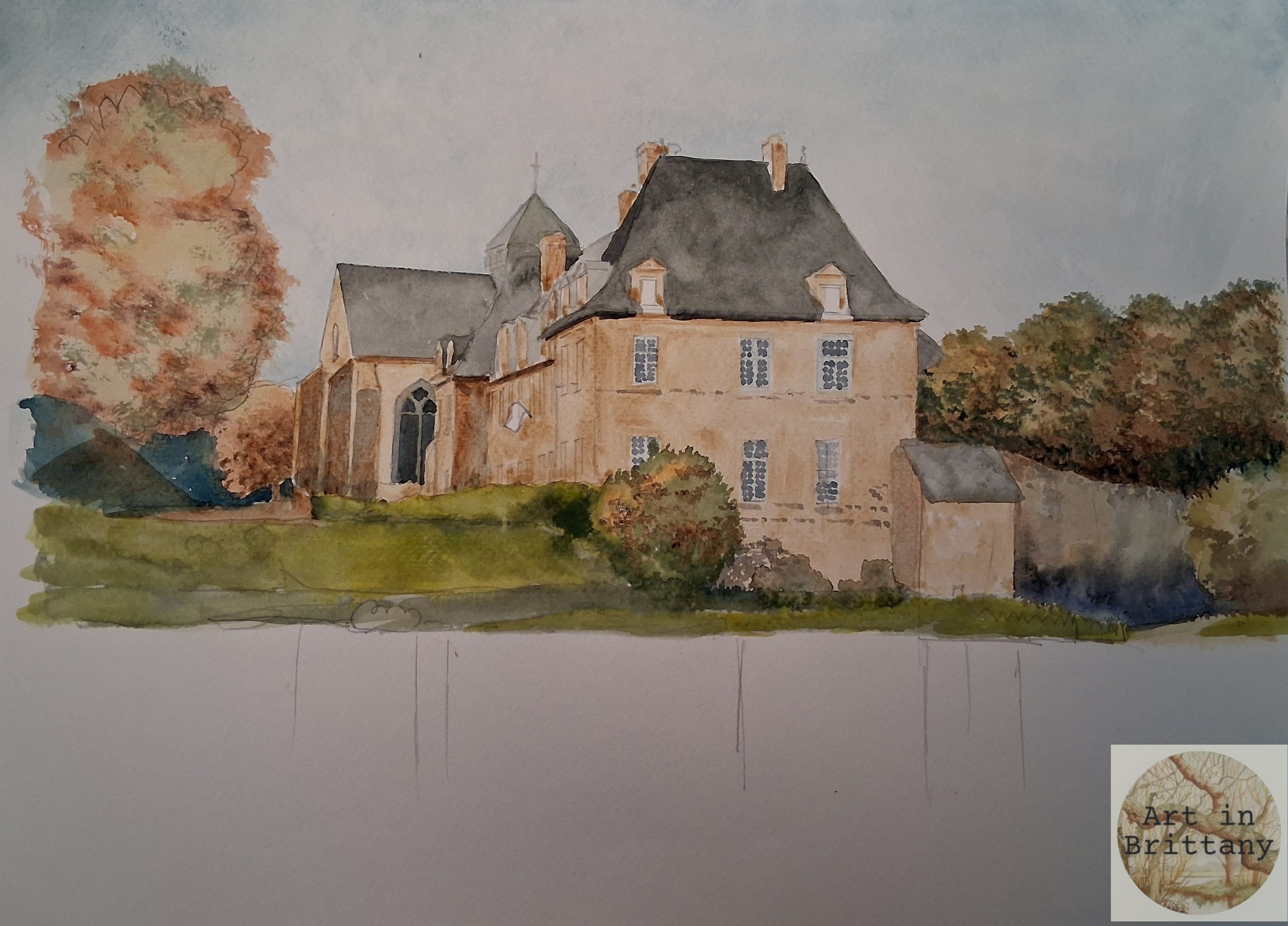
Step 6. Lay down some pale ‘golden’ washes to all of the trees. Add darker warm browns to suggest form - pay attention to tonal changes. Green washes for the grass and hedges are mixed from Prussian Blue and Raw Umber - use these in a stronger mix to add detail to the trees. Apply blue/grey washes to shadow areas and details to the stone work.
Step 7. Reflections. Wet the whole area of water and apply washes of Raw Umber under the buildings and light Prussian Blue on the lower left section. While wet, drop in darker tones form your already mixed colours, place the colour under the bank and allow them to run down, (you can tip your board to aid this process). Remember that your work will dry lighter so be bold! When you have enough colour in the water, use a rigger brush to pull up tiny strokes suggesting reeds at the waters edge.
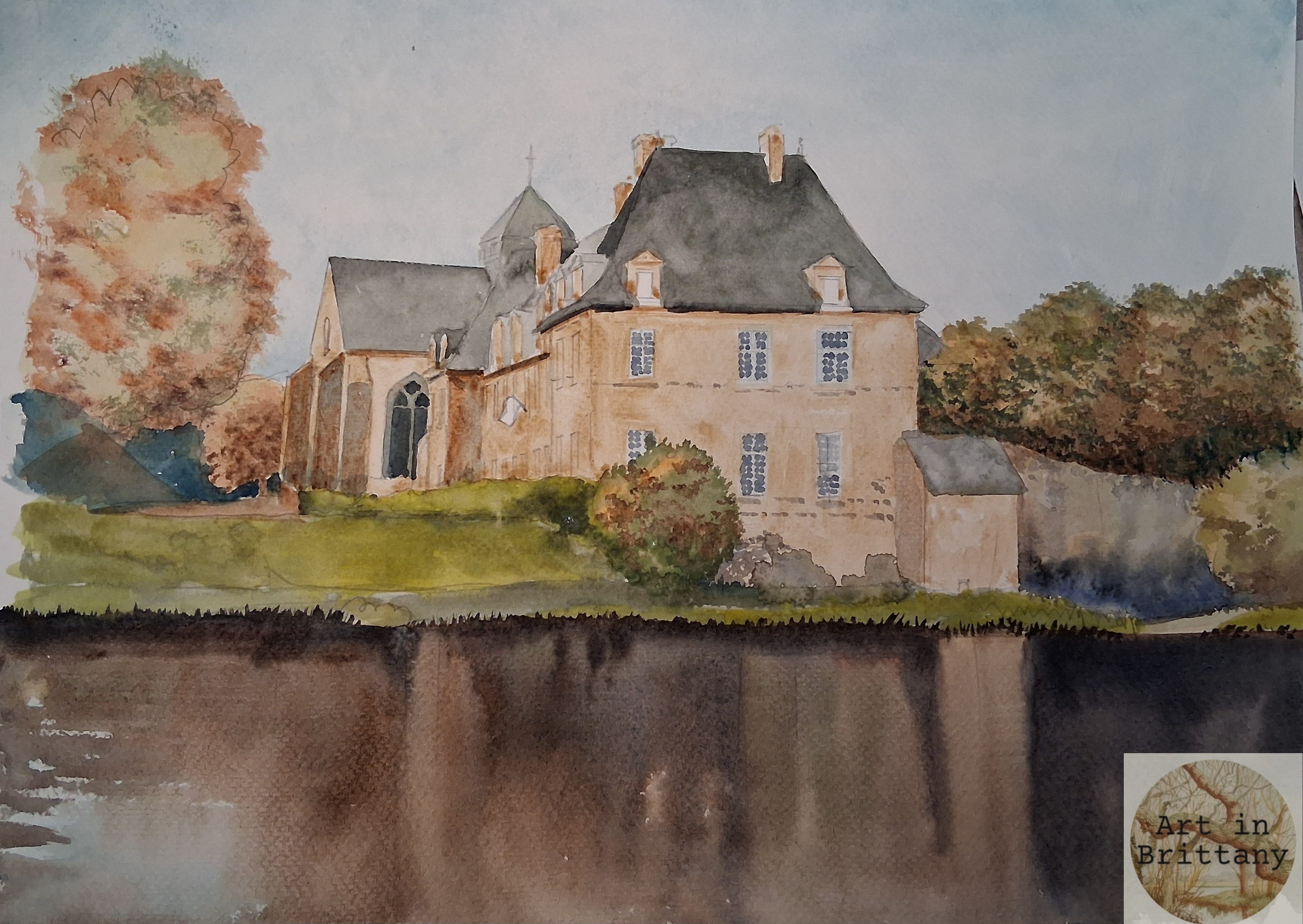
Step 8. Continue using your fine rigger brush to add detail and tone to the bushes and grasses. Add blue and red to the flag.
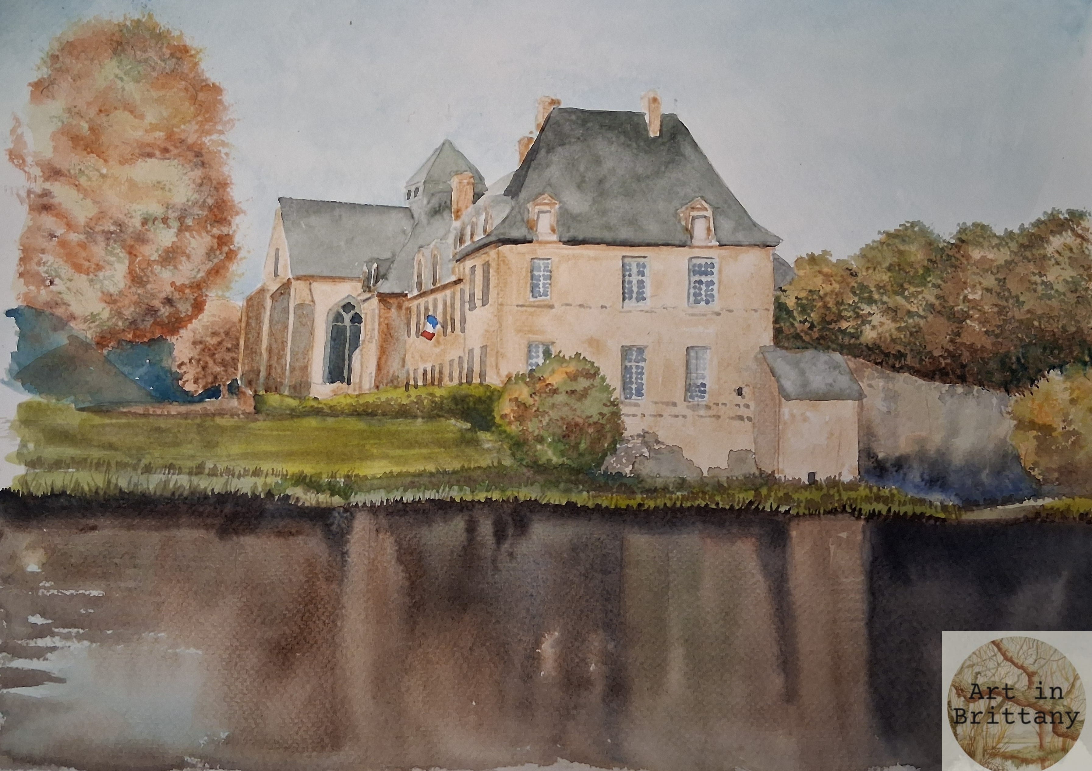
Step 9. To finish, you can add definition with a fine pen,as much or as little as you like, if you have accurately placed tone and colour blocks your work is done. Remember that we are creating an impression of our subject rather than copying brick by brick. Look at your work next day with ‘fresh eyes’ to evaluate and decide if you want to tweak. Remove pencil marks (always when completely dry) and then decide on how to crop your image for best balance.