

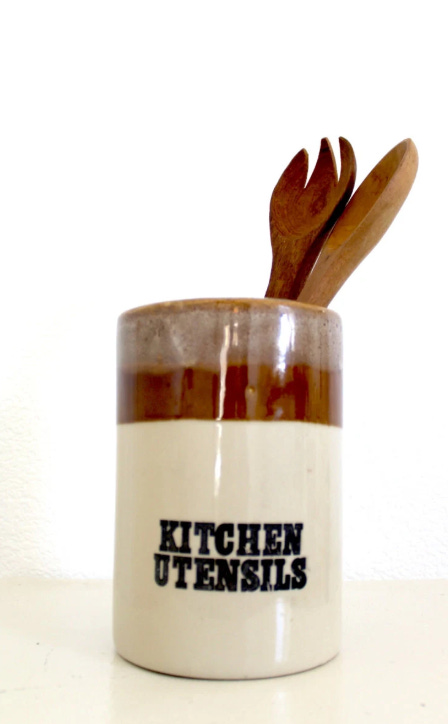
It's no secret that I am not a fan of word-ware; things that have their function written as part of their design – like utensil jars with 'utensils' written on them. Grrrrr!
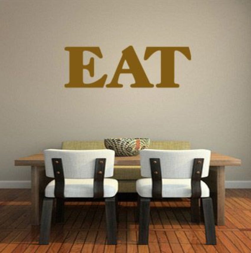
You'll be well aware of the trend in recent years to have verbs or affirmations as wall art. Things like 'EAT', 'COOK', 'SLEEP', 'RELAX' (this one makes me think of Frankie Goes to Hollywood though!), or even worse – 'DREAM BIG' and other saccharine tropes.
I saw (or heard) a comedy sketch on this very subject recently (Ed Byrne I think) where he made fun of these sorts of things and suggested suitable verbs for other rooms in the house such as the toilet!
Don't get me wrong – I am a big fan of letter forms - just not things that state the bloomin' obvious or feel like an order!
I did inherit a set of Hornsea Pottery storage jars, I love them, but I make sure they contain something other than their stipulated contents!
For fun you might consider some ironic,( or nice) personal word-art for your house or another specific place – what would you suggest for the walls of the White House or No.10 Downing Street?
What items would you label for practical or mischievous reasons?
What are your thoughts on words as art?
Perhaps you enjoy word art? It's a personal choice..
Typography.
The style and format of lettering has a huge impact on how they convey their meaning. Choosing the right font is as important as composing the right sentence. When I was teaching Graphic Design I would compare the choice of font to the sound of a voice in a voice over. It gives character and authenticity to the text if chosen well.
For instance you would not send a formal note written in Comic Sans, or a child's party invitation in A Dripping Marker.... hmmm?
There are practical considerations, such as readability – people with dyslexia for example find certain fonts easier to read than others – colour for text and background play a part in this too.
There's a lot to unpack here but don't make a mountain out of a mole hill